Wednesday 30 April 2014

Inside the exhibition!

Within the exhibition stand I want to just display simple graphics that will inform the public of cancer.

I have began to design the graphics to go within the stand. I have also produced a series of plans & elevations of the stand. These will also indicate circulation plans, lightening plans & fixtures, and the position and size of the signage within the stand.

I will also indicate which font is to be used within the design and also the size of the fonts.

Plans & elevations indicating position of graphics


Graphics to be used within the exhibition stand

Plans & elevations showing  graphics position on the left side

Graphics within the exhibition stand for the right side.

Plans & elevations showing graphic positions & placement


Tuesday 29 April 2014

Render or not to render….

I now have a final design for my exhibition stand woo hoo!!


The rationale of the exhibition stand is driven from cancer research itself. The main body of the stand and the small podiums at the front have been inspired by a test tubes as this is one of the main instruments with researching cancer. 

The lightening fixture within the stand has been inspired from the shapes found in a microscopic cancer cell.

I have kept the colours in keeping with the honours project and this is also based on the stains that scientists use to distinguish the difference between a normal and cancer cells.

I now have the challenge of rendering it in a rendering programme. As mentioned in earlier posts, I used Indigo however I wasn't pleased with the results, so the search continued for another rendering programme and I discovered 'Podium V2'


The above images show the different effects that can be achieved through rendering. 

By taking one of the rendered images and adding other images within photoshop and also a customer or two,  the design was finally coming to life!
Final design for Exhibition stand

I have also added in different backgrounds and also placed the design in situ.


Sunday 27 April 2014

Savage Beauty is coming to London!

Friday was an exciting day to say the least, not only was my project featured upon Clatterbridge's website but the V&A museum in London released some exciting news!!

SAVAGE BEAUTY IS COMING TO LONDON!!

The famous Alexander McQueen exhibition will be held in the V&A from March through to July next year! 

Since I had based my dissertation on McQueen I have wanted to be able to see the exhibition but a trip to New York in a time machine simply isn't  possible , however a short train journey to London for the day is.


Theres nothing like a bit of Self promotion!

As a designer, I am aware that the industry is very fierce and you need to be able to stand out from others.

I have used wix to create a personal website that not only showcases some of my work but also allows employers to seek out the skills I posses.

http://mollymoodesigns.wix.com/njphennah
Home page of my website

Designer profile page

Portfolio showing a range of different skills

contact page to allow others to contact myself

Within the website I have also added links to my twitter, lindekin profile, pinterest boards and this blog.

At the moment I have the website up and running and gradually over time I will add more and more images from both current and previous projects.

I am also designing my CV as this is also a vital tool for potential employers.

As self promotion is also key within the industry I am designing a business card with a twist! It is currently in the mock up stages and I am really pleased with the outcome so far. Keep your eyes peeled!!

Saturday 26 April 2014

Designing a logo!!


As part of the honours project, a promotional design package will be designed to assist with the marketing and promotion of the concept.

One of the major parts of the promotional package is a logo for the concept.

I have began to design logo concepts based upon both the current logo which is used for Anthropologie and also a strap line for the concept.

Selection of Anthropologie logos


Font used within Anthopologie logo

Font which is currently used within Anthropologie publications

Font which is currently used within Anthropologie publications

Concepts for a new logo


 I have drafted a spider diagram with ideas for the strap line which I could use for this project. 'Anthropologie' means to study the behaviour of human beings and within this project I would like to shock and create a reaction within a person, therefore I have wrote idea which I feel would best fit with this idea in mind.


Spider diagram of strapline ideas

Straplines ideas includes:- 'The Journey', 'Reflection', '1 in 3', "Inspiration', 'Beauty and the beast' and 'inside out'

The two which I feel best fit are '1 in 3' - 1 in 3 people develop cancer within their life time and 'The journey' as a person goes through a journey through life and my journey with my dad has inspired this project.


Concepts for '1 in 3' logo

Fonts which I feel suit the brand and I have used within the development of the logo
Logo development for '1 in 3'

I am still developing further this logo.


My honours project is featured …..

As I use twitter to share my blog on a weekly basis, I have attracted the attention of many charities that are driving cancer awareness, in particular Clatterbridge Cancer centre NHS foundation.

Clatterbridge Cancer charity is part of the Clatterbridge Cancer clinic.

 The clinic headquarters are situated on the Wirral and they treat people with cancer who live within Merseyside and the surrounding areas.

There are also other clinics are different locations through out the North West, including the Linda McCartney clinic at the Royal Liverpool Hospital, and the  Delamere Clinic at Halton hospital.

Clatterbridge treat patients through different forms of radiotherapy and chemotherapy and my dad received his chemotherapy treatment at both the above clinics and his appointments were arranged through Clatterbridge.

 Clatterbridge Cancer charity has been following my progress on this project and on several occasions have retweeted posts from this blog.


I emailed Susan King, Communications Officer at Clatterbridge and after a few emails to confirm the processes and procedures and also the rationale behind my design, Susan very kindly featured my honours project on the 'news' section of Clatterbridge Cancer charity website.


The link for the story is below;-


I am so thrilled with this story and I was very emotional and proud upon seeing it. I know my dad  would have been so proud of it too, after all he is my inspiration and drive!

Thursday 24 April 2014

'Let me take a photoie…….'

'Strike a pose there's nothing to it, …Vogue!!'

Today has been a very exciting day! The fashion editorial for the project was shot! 

As mentioned in earlier posts, and it all happened today. I collaborated for the shoot, with photographer Claire Basik, make up artist Kimberely Lumsdon and two models , Frankie and Abbe from J'Adore Models , Manchester.

The shoot took place in a studio above a bar called 'The Terrace', on Thomas Street in Manchester and as well as having basic editorial shots,  the models also posed within the prop that I have made for the window display.

I am so pleased with the overall look and final images from the shoot. Images below show a few of the images from behind the scenes following our successful day at the Studio.


Monday 21 April 2014

Exploring sketch up! - Exhibition design


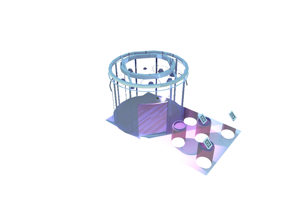
I have began to build up the design for my exhibition design in google sketch up.

 I originally designed a basic transparent circle but have now developed a structure that the outer walls can be held up by. I have also designed the lightening within the stand , this is based upon the shapes within the cancer cells. 

Development of concept sketch 2 in google sketch up

Development of concept sketch 2 in google sketch up (Isometric view)

Development of concept sketch 2 in google sketch up - (Left)
Exhibition stand lightening


I have also began to render the sketch up images using different rendering programmes. Below are a series of examples rendered using 'Indigo' for mac. I am still not entirely happy with the overall position of the lightning and I am still experimenting with getting this at the right angle.


01 09 10